Pages & Content
The Website group in the sidebar holds everything about how your storefront looks and reads: Homepage, Pages, Menus, Blog, Media, Theme, Error Pages and Redirects. The homepage has its own page: Homepage. The blog too: Blog.
Themes
Website → Theme (also the Theme card in Settings)
Your theme is the overall design of your storefront. Three are available:
- Classic: the original Kaniva storefront.
- Modern Industrial: a bold, modern design for manufacturers and enthusiast brands.
- Trailhead: a fabrication-shop storefront for small shops that build what they sell, with fitment-first shopping.
Every store starts on Classic. Nothing changes on your storefront until you activate a different theme. The live one is marked ACTIVE.
What changes, and what does not
A theme changes appearance only. Switching does not touch your products, categories, customers, orders, inventory, pricing, payments, shipping, reviews, blog posts or settings, and you can switch back at any time. Each theme keeps its own settings, so trying a theme and going back loses nothing.
Preview, then activate
- Click Preview on a theme's card. You see it on your own storefront; customers keep seeing your live theme.
- A banner on the Theme page shows while a preview is running. End preview stops it.
- When you're happy, click Activate and confirm.
Which pages a theme covers
Modern Industrial and Trailhead style every storefront page: the homepage, catalogue, categories, product pages, cart, reviews, blog, your own pages, the customer account pages, the sign-in and create-account pages, the instant quote page, and pages customers reach from an email (paying a balance or an invoice, tracking a shipment, a booking, leaving a review).
Checkout and the admin are never themed. They keep the standard Kaniva design whatever theme you run.
Colors, type, logo and banners
The other tabs on the Theme page are Colors & Type, Logo & Favicon, Banners and Advanced. They apply to whichever theme is active, so your brand colors and logo follow you when you switch.
- Colors & Type: Quick Start Presets (click one to apply its colors, then tweak; Revert Changes undoes it), brand, text and background colors, Heading Font and Body Font, header and footer colors, Button Corners, a Neutral Palette, status colors and Build to Order Colors. Click Save Theme Settings.
- Logo & Favicon: Upload Logo (PNG, JPG, GIF or WebP, up to 2 MB; SVG isn't accepted), Upload Favicon, and a black-and-white Print logo for receipts, labels and packing slips.
- Banners: a Top Banner above the header and a Header Banner below it, each with its own text and colors. Click Save Banner Settings.
- Image Sizes: the logo size, product image size, Product Grid Image Display (Fill or Fit) and Default Product Grid Columns (2 to 4). Click Save Image Settings. Customers can switch columns themselves on the products page, and phones always show 2.
Customize (Trailhead)
Trailhead has its own settings. Click Customize on its card, or the Customize Trailhead tab. You can set it up before you activate it: Preview on your store shows it to you alone.
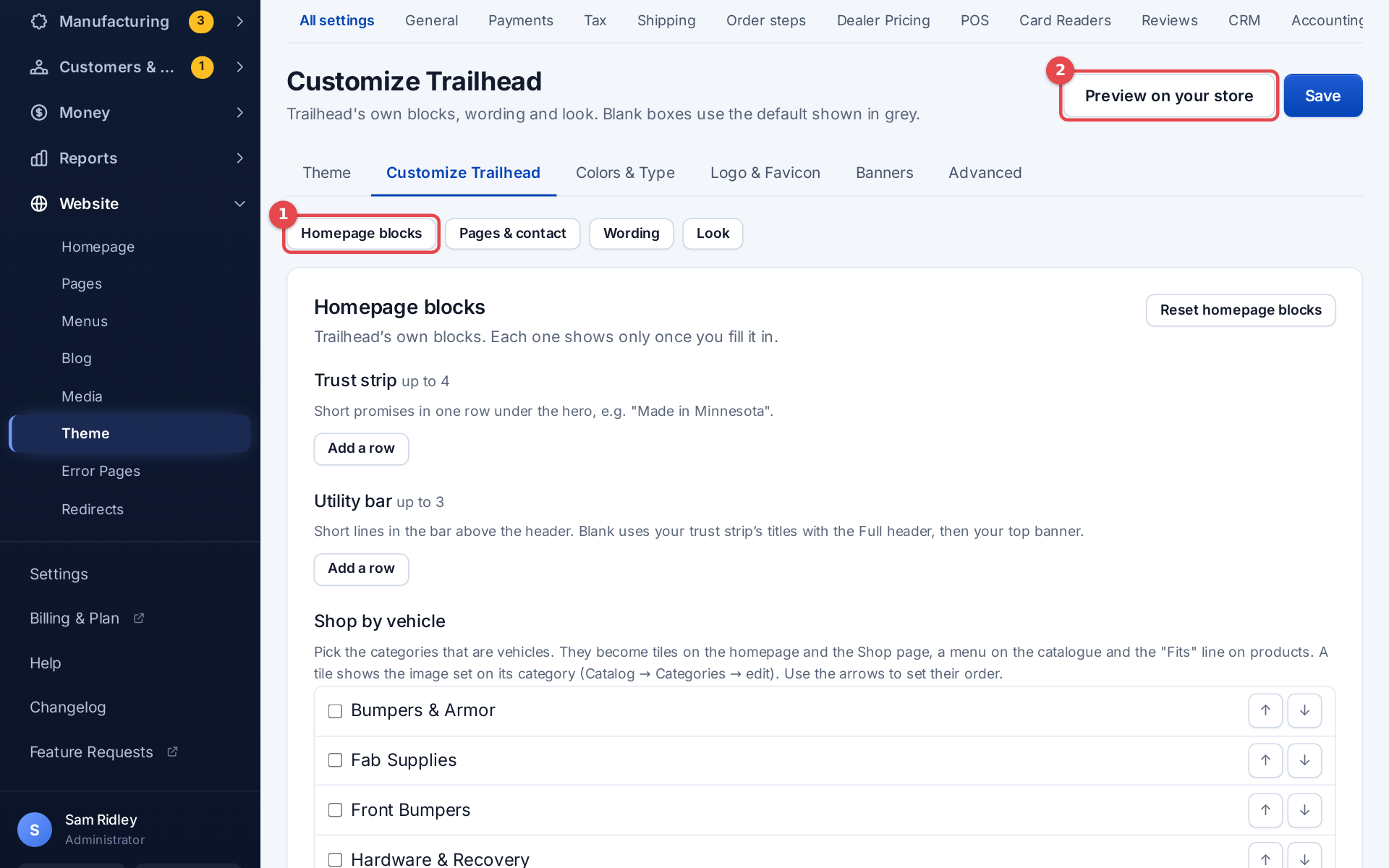 The Trailhead Customize panel
- Homepage blocks: each shows only once you fill it in.
- Trust strip: up to 4 short promises in a row under the hero
- Utility bar: up to 3 short lines in the bar above the header
- Featured categories (Shop by vehicle): tick the categories to put up front, your vehicles or any collections you sort by, and order them with the arrows. They become tiles on the homepage and the Shop page and a menu on the catalogue. A tile shows the image set on its category
- Featured categories are: Vehicles (the default) shows a name like "Jeep Cherokee XJ 84-01" as make, model and years and gives products in them a "Fits" line; Collections shows names as they are, with no "Fits" line. The words on the tiles and menus ("Shop by vehicle", "Shop by your rig", "parts") are yours to change: the label and heading below, and the Wording section Shop and cart
- Rating under the hero: your star rating and review count under the homepage hero, once you have enough reviews (on by default)
- Featured tiles label and Featured tiles heading
- Story band: a dark band about your shop with a heading, text, a photo, up to 3 facts and a button
- Pages & contact: Help menu (on by default) gives text pages (Shipping, Returns, Terms…) a menu on the left listing your pages and Contact; pages with photos or product rows always run full width. Contact page quick answers: up to 6 links shown under "Before you write" on the Contact page. Contact page photo and Photo caption.
- Wording: the words Trailhead puts on your store, from section labels to stock lines and footer headings. The current wording shows in grey; leave a box blank to keep it. To leave a spot on the page empty instead (no small label above a heading, say), tick Show nothing here under the box. The same tick is under the featured tiles' label and heading.
- Look: the Header style, the In-stock tag, a Trailhead-only Logo, colors and fonts.
- In-stock tag: product cards you can ship now get a green tag (the default), next to the Built to order and out-of-stock tags. Change its words under Wording → In-stock tag on product cards, or choose to tag only built-to-order and out-of-stock products
- Full (the default): a colored strip with your trust lines, a wide search box, and a category bar with your featured categories (Shop by vehicle) and your categories
- Simple: one dark row with your menu, a Shop menu and a small search box
- On phones both look the same. Leave a color or the logo blank to use your store-wide Colors & Type setting; leave a font blank to keep Trailhead's own
Click Save to keep your changes. Reset on a section puts just that section back to Trailhead's defaults.
The hero's text position and phone photo are set on the Hero Banner section itself; see Homepage.
Edit from your storefront
When you're signed in as the store's owner or an admin, a slim bar sits along the bottom of every storefront page:
- Edit product, Edit post, Edit page, Edit category or Edit homepage opens the admin screen for what you're looking at
- Admin opens your dashboard
- Hide folds the bar into a small pencil tab in the corner. Click the tab to bring it back. Your choice is remembered in that browser
Customers never see it.
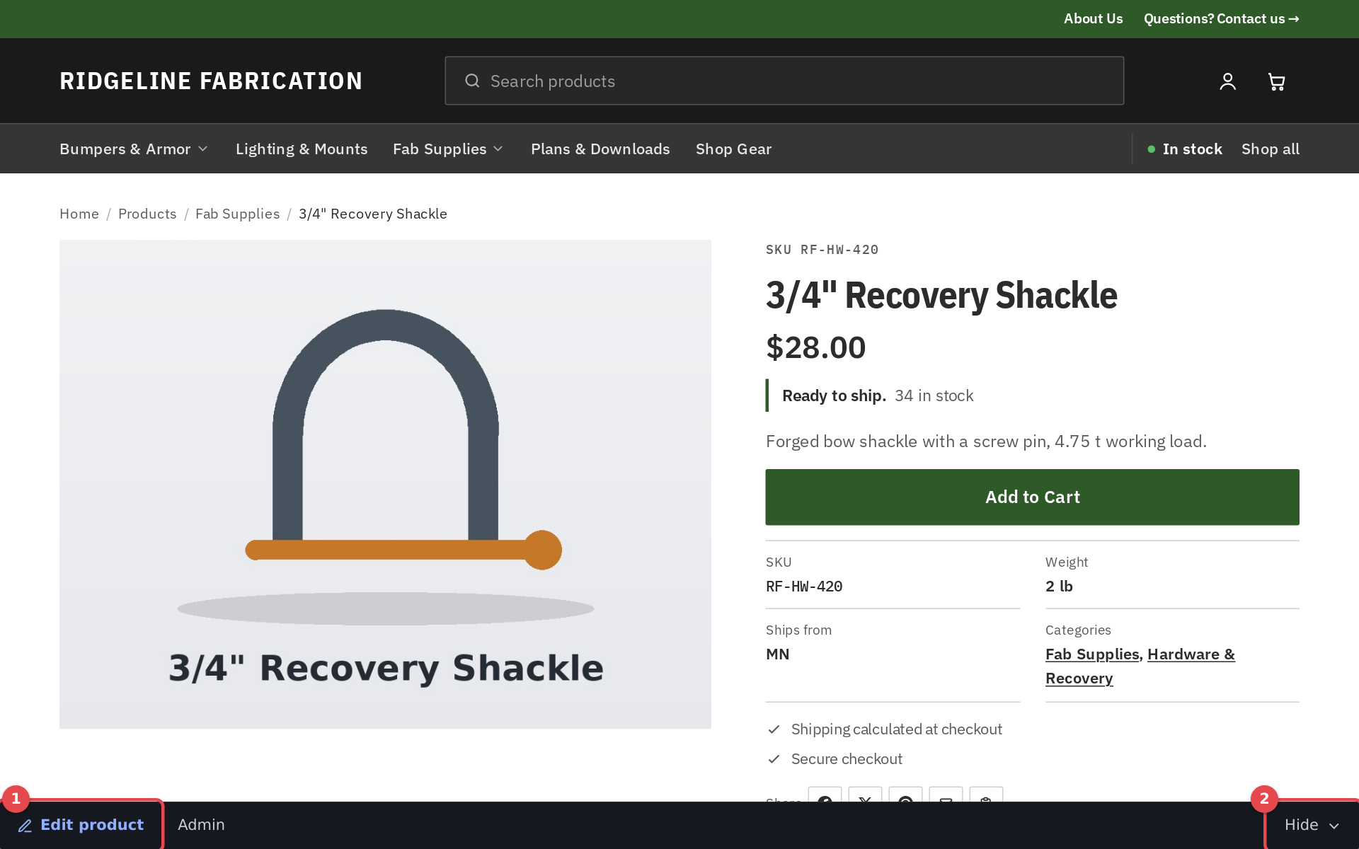 The edit bar on a product page
Custom pages
Website → Pages lists your pages with their status (Published or Draft) and where they appear in navigation. Edit Homepage at the top opens Homepage.
Add a page
- Click Add Page
- Enter the Title. Leave URL Slug empty to make one from the title
- Optionally fill in Meta Description and Meta Keywords under SEO Settings
- Tick Publish page when it's ready. Unpublished pages are not visible to visitors
- Click Create Page
On each page in the list:
- Edit Sections builds the page's content from blocks (below)
- Settings changes the title, slug, SEO and publishing
- View opens it on your storefront
- Delete removes it
Build a page from sections
- On Website → Pages, click Edit Sections on the page
- Click Add Section, give it a Name and pick a Section Type
- Fill in the settings for that type and click Create Section
- Drag sections by the handle to reorder them, and use the Active toggle to show or hide one
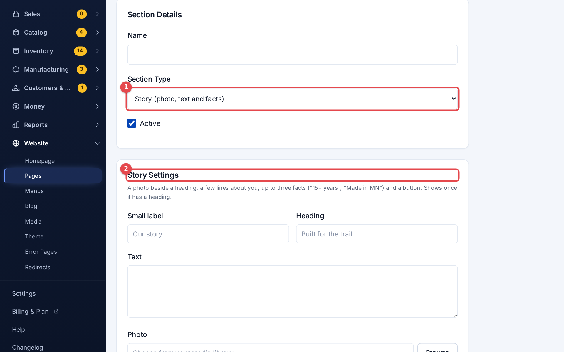 Adding a section to a page
Section types:
| Type | What it shows |
|---|---|
| Hero Banner | A big banner with a title, subtitle, button and background image |
| Rich Text (WYSIWYG) | Formatted text from the editor |
| Text Block | A title and text with a background color and alignment |
| Image Banner | One image, optionally linked |
| Two Columns | Two columns of content, split 50/50, 60/40 or 40/60 |
| Story (photo, text and facts) | A photo beside a heading, a few lines about you, up to three facts and a button |
| Promises strip | Up to four short promises in one row |
| Photo Gallery | Up to eight photos with optional captions |
| Call to Action | A closing band with a heading, text, up to two buttons and an optional background photo |
| Custom HTML | Your own HTML and CSS. Scripts, embeds and forms are taken out when you save |
| Featured Products | A grid of products |
| Category Grid | Category cards |
| New Arrivals | Your newest products |
| In Stock Products | Products you can ship now |
| Latest Blog Posts | Recent posts |
| Testimonials | Customer reviews |
| Newsletter Signup | An email signup form |
An About page
There's no separate About setting: build About as an ordinary page. A good order is Story → Promises strip → a Text Block ("What we make") → Photo Gallery → Call to Action.
- A Story and a Call to Action show once they have a heading. When a page opens with a Story, its heading is the page's heading
- On Trailhead, leave the promises blank to use the trust strip from Customize. The gallery's first photo is drawn largest
- Buttons link to a page on your store (
/products), a web address,mailto:ortel:
Menus
Website → Menus edits your storefront navigation. It has a Header Menu and a Footer Menu tab.
Add a menu item
- Pick the tab
- Choose the Type:
- Internal Route: a built-in page: Home, Products, Shop (categories), Blog, Contact or Cart. Shop (categories) is the Shop page with category tiles; Products is the full catalogue
- Custom Page: one of your pages
- External URL: any web address. Tick Open in new tab if you like
- Enter the Label (the text shown)
- Click Add
Drag an item by its handle (☰) to reorder; the order saves by itself. Use the toggle to hide an item without deleting it. The edit and delete icons on each item change or remove it.
If a menu has no items, your store shows its default navigation. Once you add items, they replace the defaults for that menu.
Contact, sign-in and register pages
Settings → Contact & Account Pages sets the wording on three built-in pages:
- Contact Page: title, introduction, an optional colored response-time block, Enable Contact Form, and Request a Callback (a form customers use to ask for a phone call; requests land in Customers & CRM → Callbacks). The phone, email and address shown come from Settings → General
- Login Page and Register Page: titles, subtitles, button text, and the benefits listed on the register page
- Social Media Links shown in your footer
Media
Website → Media is your image library. Upload images (JPEG, PNG, GIF or WebP), copy an image's Optimized URL (WebP) or Original URL (Full Quality), or Delete it. The image pickers in the page, homepage and theme editors (Browse) choose from the same library.
Error pages
Website → Error Pages sets what customers see when a page isn't found or something goes wrong: a layout style, Heading, Message, a Primary Button and Secondary Button, and a Background Image (PNG, JPG, GIF or WebP, not SVG). Click Save All Error Pages.